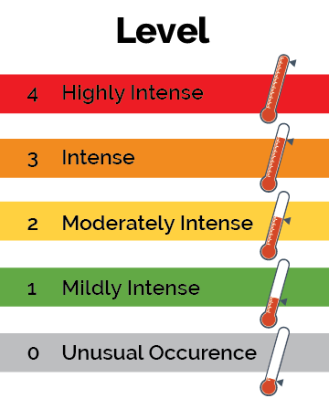
For years, we have relied on the familiar red-yellow-green color scheme to signal urgency in technology dashboards, status pages and emergency communications. While simple, this approach assumes everyone perceives color the same way—and that assumption creates real accessibility gaps.
We learned when working on updating our digital content for WCAG compliance an estimated one in 12 men and one in 200 women experience some form of color vision deficiency. For these users, red and green can be difficult or impossible to distinguish. This small design change can reduce stress during high pressure situations, improving decision-making and time to resolution.
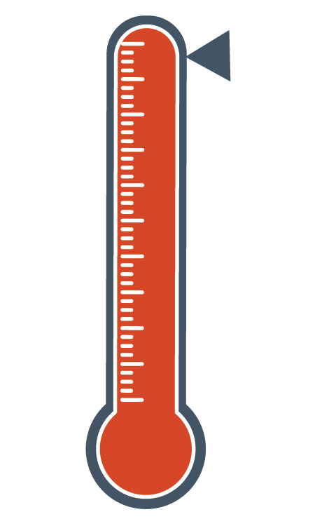
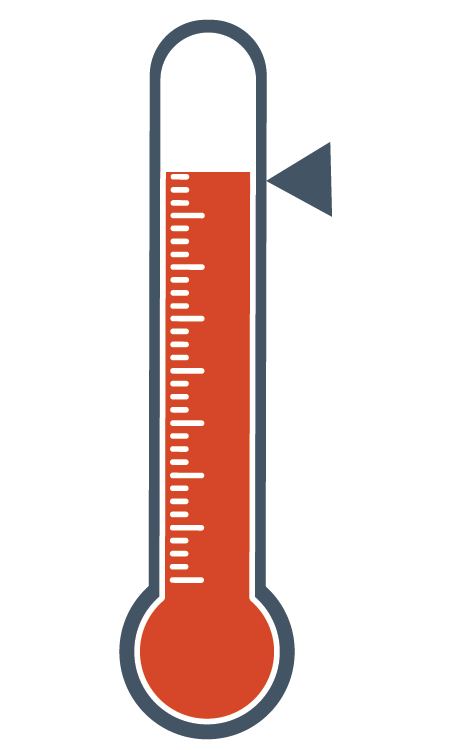
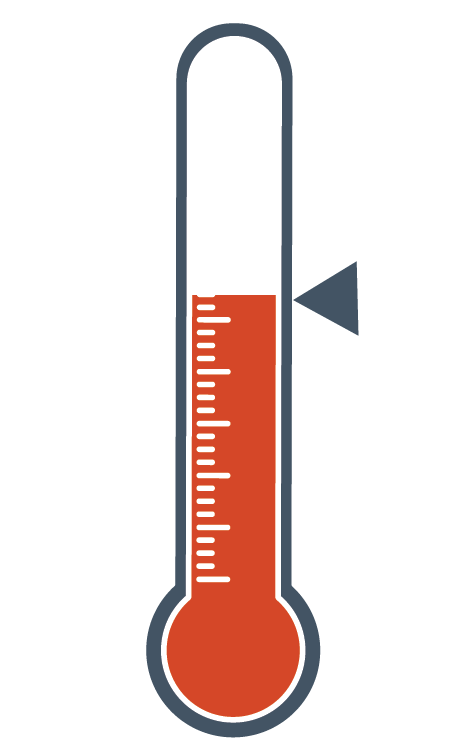
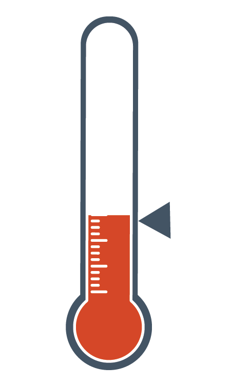
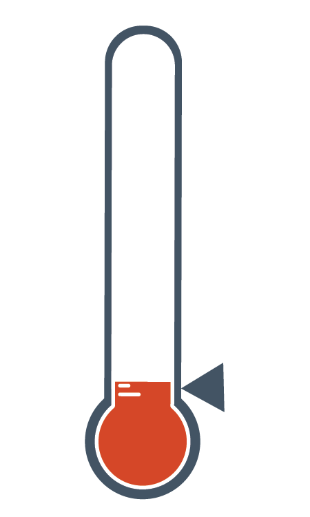
We have added thermometers to our crisis communication plans. Unlike color alone, thermometers communicate escalation through shape, fill level and metaphor. Even without color, the meaning is intuitive: the higher the temperature, the greater the urgency.
If you are interested in using our thermometer icons to embed in dashboards or alerts, we are happy to share those images with you here to download for free.
Let us know if you find this useful to turn the heat up, visually, so to say.
Right click any of the images below to save them, or download all the images in a .zip file.